
You pick up your prescription, open the bottle, and stare at the label. It’s not the same as last time. The font is bigger here. There’s a new line about why you’re taking it. The instructions are in a different spot. You’re not imagining it. Your medication bottle really does look different - and it’s not just your pharmacy being inconsistent. It’s the result of a patchwork of rules, outdated systems, and slow-moving regulations across the United States.
Why Do Prescription Labels Vary So Much?
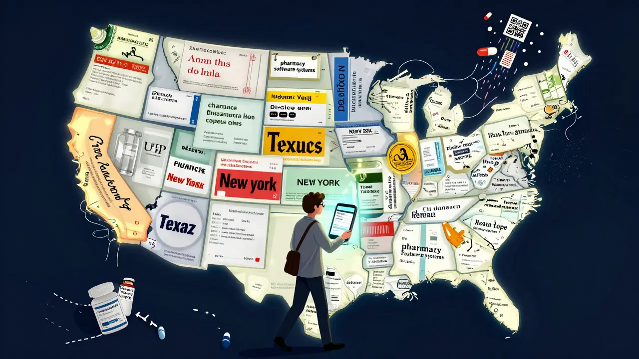
No single federal law forces pharmacies to use the same label layout. The FDA sets rules for the scientific information that goes on drug packaging - things like side effects, active ingredients, and warnings - but those are meant for doctors and pharmacists, not patients. The actual label you hold in your hand? That’s mostly controlled by individual state pharmacy boards. There are 50 states, plus territories. Each one has its own rules about what must be on the label, what font size to use, and even whether the pharmacy’s phone number has to be in bold.
For example, Texas requires the prescription ID number to be printed in at least ten-point Times Roman font. California mandates bilingual labels for certain medications. Some states want the reason for the prescription written out in plain language - like “for high blood pressure” - while others allow medical jargon like “for HTN.” This isn’t just about style. It’s about safety. A patient who gets their blood thinner from two different pharmacies might see two completely different layouts. One says “take one pill twice a day.” The other says “take one tablet q12h.” One person understands. The other doesn’t. And that’s how mistakes happen.
What’s the USP <17> Standard, and Why Does It Matter?
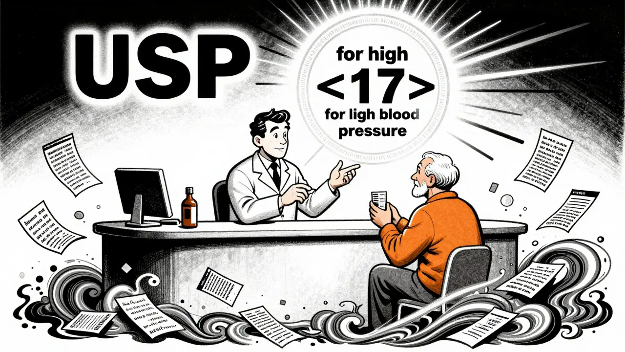
In 2012, the United States Pharmacopeial Convention (USP) released General Chapter <17>, a set of evidence-based guidelines designed to make prescription labels easier to read and understand. It wasn’t a law. But it was the first time a national body said: here’s how you actually design a label so patients don’t mess up their meds.
USP <17> says use sentence case - not all caps. Use sans-serif fonts like Arial or Helvetica, not Times New Roman. Make sure there’s enough space between lines. Put the most important instructions - like dosage and timing - at the top. Include the reason for the medication. Use high contrast: black text on white background. Avoid abbreviations. Don’t say “q.d.” Say “once daily.”
These aren’t suggestions for design nerds. They’re based on real studies. Research shows patients with low literacy, older adults, and non-native English speakers are far more likely to make dangerous errors when labels are cluttered or confusing. One study found that when pharmacies followed USP <17> guidelines, patient clarification calls dropped by 27%. That’s not just convenience - it’s fewer trips to the ER.
Why Haven’t All Pharmacies Switched Yet?
Changing a label isn’t like updating your phone’s wallpaper. It means reprogramming pharmacy software, retraining staff, printing new label templates, and sometimes even replacing bottle caps or containers. There are about 12 major pharmacy management systems in use across the country. Each one handles label formatting differently. Even within the same chain - say, CVS or Walgreens - a store in Ohio might use a different system than one in Georgia.
Cost is another barrier. The National Association of Boards of Pharmacy estimates it costs between $2,500 and $7,000 per pharmacy location to fully update systems for standardized labeling. For small independent pharmacies, that’s a big chunk of cash. And without federal enforcement, there’s no penalty for sticking with the old layout.
As of 2023, only 28 states have adopted USP <17> in any form. Just 15 have fully implemented it. That means if you live in New York, your label might be clear and simple. If you live in Florida, it might still use tiny font and cryptic abbreviations. And if you move between states? Your labels change again.
Real People, Real Mistakes
It’s not theoretical. People have taken wrong doses because of label changes.
One Reddit user shared how they accidentally doubled their blood thinner dose after a refill. The new label didn’t show the time interval between doses. They assumed “take twice daily” meant morning and night - but the previous label had specified “every 12 hours.” They ended up in the hospital.
A 2021 survey by the National Community Pharmacists Association found that 68% of patients had trouble understanding their prescription labels at least sometimes. Nearly one in five reported a medication error they believed came from confusing labeling. In Texas, between 2019 and 2022, 417 reported medication errors were linked directly to label confusion - 18% of all reported errors.
And it’s not just older adults. A young mom managing her child’s asthma inhaler might miss the “use as needed” note if it’s buried under five lines of pharmacy contact info. A veteran on multiple medications might mix up which pill is for which condition if the purpose isn’t clearly labeled.
What’s Changing Now?
Change is coming - slowly.
CVS Health announced in April 2023 that it will roll out USP <17>-compliant labels across all 10,000+ of its pharmacies by the end of 2024. They tested it in 500 stores first. The result? A 33% drop in patient questions about dosing. That’s not just better service - it’s fewer phone calls for pharmacists, fewer trips to urgent care, and safer outcomes.
The Biden administration’s 2022 Patient Safety Action Plan includes a goal to get 90% of states to adopt standardized labeling by 2026. The FDA also released draft guidance in June 2023 titled “Enhancing Patient Understanding of Prescription Drug Container Labels.” That doesn’t mean it’s law yet - but it’s a strong signal that federal action could be coming.
Meanwhile, the market is adapting in other ways. Smart pill dispensers, mobile apps, and digital refills now let patients see their labels in a clean, consistent format on their phones. Some apps even translate instructions into Spanish, Mandarin, or Tagalog. These tools don’t fix the physical label - but they give patients a reliable backup.
What You Can Do Right Now
You don’t have to wait for the system to fix itself. Here’s how to protect yourself:
- Ask for a plain-language version. If the label says “for HTN,” ask them to write “for high blood pressure.”
- Check the dosage timing. Is it “every 8 hours”? “Three times a day”? “Take with food”? If it’s unclear, ask the pharmacist to explain it out loud.
- Request a large-print or audio label. Many pharmacies offer these, but only 38% consistently provide large print. Don’t assume it’s available - ask.
- Take a photo of your label. Save it on your phone. Compare it to your next refill. If something changes, ask why.
- Use a pill organizer. Even with a perfect label, mixing up pills is easy. A simple weekly organizer adds a layer of safety.
Medication errors are one of the leading causes of preventable harm in U.S. healthcare. The NIH estimates they cost $29 billion a year. And inconsistent labels? They’re responsible for 8 to 12% of those errors. That’s not just a pharmacy problem. It’s a public health problem.
Every time you question a label, you’re not being difficult. You’re helping fix the system.
Frequently Asked Questions
Why do my prescription labels look different every time I refill?
Different pharmacies use different software systems, and each state has its own labeling rules. Even if you go to the same chain, a store in one state may have a different label format than one in another. Switching between pharmacies or refill systems can also change the layout. This inconsistency is why patients often get confused.
Is there a law that requires standard prescription labels?
No federal law currently requires all prescription labels to look the same. The FDA regulates professional drug labeling, but not the patient-facing label on your bottle. The USP <17> standard is the best practice for patient safety, but it’s voluntary. Only 28 states have adopted it in some form, and only 15 fully enforce it.
What should a good prescription label include?
A clear label should have: your name, the medication name, dosage (e.g., “5 mg”), how often to take it (e.g., “once daily”), the reason for the medication (e.g., “for high blood pressure”), the dispensing date, the pharmacy’s name and phone number, and clear instructions using plain language. Avoid abbreviations like “q.d.” or “b.i.d.” - they should say “once daily” or “twice daily.”
Can I ask for a large-print or braille label?
Yes. Under the Americans with Disabilities Act, pharmacies must provide accessible formats if requested. This includes large print, braille, or audio labels. But many pharmacies don’t offer them unless you ask. Don’t assume they’re available - request them specifically. Some pharmacies even offer QR codes that link to audio instructions.
Why don’t pharmacies just use the same label everywhere?
It’s expensive and complicated. Pharmacies use different computer systems, and updating them to match a national standard costs thousands per location. There’s no federal mandate to force change, so many pharmacies stick with what’s already in place - even if it’s confusing. Some chains, like CVS, are making the switch because they’ve seen fewer patient errors and lower call volumes. But it’s still not universal.
William Liu
December 17, 2025 AT 20:37Finally someone put this into words. I’ve had pills with instructions so small I needed a magnifying glass. No joke.
Danielle Stewart
December 18, 2025 AT 06:12I always ask for a printed plain-language version now. Pharmacists think I’m being difficult, but I’d rather waste 2 minutes than end up in the ER. My grandma did, and she didn’t make it. Don’t wait until it’s too late.
Chris porto
December 19, 2025 AT 13:26This isn’t just about labels. It’s about how we treat people who are already vulnerable. If your system can’t make a simple instruction clear, maybe the system needs to change, not the patient. We blame people for not understanding when the design was never meant for them to begin with.
Aadil Munshi
December 20, 2025 AT 04:28Oh wow, so the real issue isn’t patients being dumb - it’s that we’ve built a healthcare system that assumes everyone reads like a pharmacist. And now we’re surprised when people mess up? The USP guidelines aren’t ‘nice to have,’ they’re basic human decency. But hey, let’s keep letting small pharmacies go bankrupt trying to keep up while big chains get subsidies for everything else. Classic.
Frank Drewery
December 21, 2025 AT 14:07I work in a rural pharmacy. We switched to USP-compliant labels last year. Patient calls dropped. No more ‘what does q.d. mean?’ It’s not magic. It’s just clear writing. And yeah, it cost us $5k, but we got a grant. If your state won’t help, ask your local health dept. They might surprise you.
mary lizardo
December 22, 2025 AT 09:39It is profoundly disturbing that a nation with such advanced medical technology cannot standardize a pharmaceutical label. The lack of federal oversight is not merely negligent - it is a systemic failure of governance. The USP guidelines are not recommendations; they are a baseline for cognitive accessibility. The fact that only 15 states enforce them reveals a moral bankruptcy in public health policy. I am not exaggerating when I say this is a civil rights issue.
jessica .
December 23, 2025 AT 00:49They’re doing this on purpose. Big Pharma and the FDA want you confused so you keep buying more pills. You think it’s an accident that your label changes every time? Nah. They’re testing your compliance. If you don’t know what you’re taking, you’ll take more. Watch the news - they’re already pushing QR codes so they can track your every move. This is surveillance disguised as safety.
Ryan van Leent
December 24, 2025 AT 07:13Why dont people just read the damn label and ask if they dont get it. Its not that hard. I mean come on. You dont know what q.d. means? Look it up. Or get a better phone. I dont get why we need to baby everyone. My grandma took 12 meds and never messed up. She just paid attention. Now we got apps and pill boxes and audio labels. What happened to common sense
Adrienne Dagg
December 24, 2025 AT 09:30OMG YES. I just got my new blood pressure med and the label said ‘take one q12h’ and I thought ‘what’s q12h??’ I called the pharmacy and they were like ‘oh it means every 12 hours’ and I was like ‘why not just say that??’ 🤦♀️ I asked for a new one and they printed me a plain version. I took a pic and sent it to my mom. She’s 78 and now she uses it too. 🙌
Erica Vest
December 26, 2025 AT 02:07There’s a 2023 JAMA study showing that standardized labels reduced medication errors by 31% in elderly populations. The cost of implementation is a one-time investment. The cost of errors? Lifelong disability, hospitalizations, death. The math isn’t even close. If your pharmacy hasn’t switched yet, ask them why - and if they can’t give you a clear answer, switch pharmacies. Your life is worth more than their software budget.
Chris Davidson
December 26, 2025 AT 18:18Label standardization is a federal mandate waiting to happen. The FDA draft guidance is the first step. States will follow. Pharmacies will comply. The only question is whether it will be too late for someone who already got hurt. We’ve known this for a decade. Why did it take a patient dying in Texas to get this far?
Carolyn Benson
December 27, 2025 AT 21:06Oh please. You think this is about safety? It’s about control. The FDA doesn’t want you understanding your meds - they want you dependent. Look at the history. Every time someone tries to simplify a label, some bureaucrat adds another line about ‘consult your physician.’ That’s not help. That’s liability padding. And now they’re pushing QR codes? So you can scan your pill and get a 10-page PDF from Big Pharma? No thanks. I’ll stick with my handwritten note on the bottle. At least I know who wrote it.
Sajith Shams
December 29, 2025 AT 13:32You guys are missing the real problem. It’s not the label. It’s the fact that 70% of prescriptions are refilled without a doctor’s review. You get the same bottle every month for years and never get asked if you still need it. That’s the real killer. A clear label won’t help if you’re still taking a drug you stopped needing three years ago. Fix the refill system first. Labels are just a Band-Aid.